 This is for all of you card makers that are using the Inspiration to cut your welded sentiments and embellishments. Depending on the font selection that you use, it can be pretty easy to get discouraged with the quality of the cuts. One of the reasons for this is because of the amount of detail and the generally small size of the words that go on such a small palette like a card.
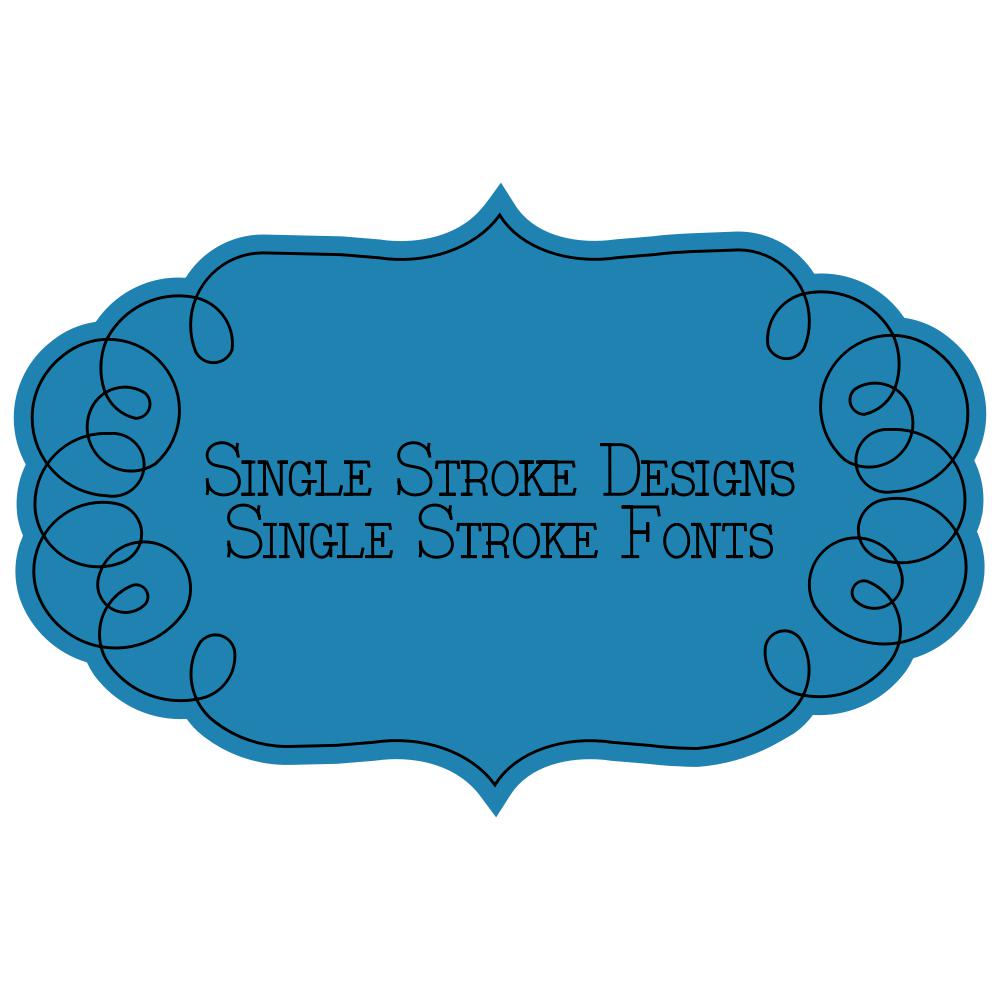
The best way to determine a good font for cutting is to zoom in on it and make sure that all the cutting lines are very smooth: no rough edges or sharp corners. If the cutting lines aren’t smooth there’s a good chance the blade will catch on those rough spots and start to lift and tear the paper. The thinner a font is, particularly with skinny script fonts, the more likely it is to lift and tear as it’s cutting if the settings aren’t perfect.
Always make sure that your blade is in good shape and the pressure settings are good. Having a new mat to cut on is also a great idea—it holds the project firmly to the mat. The bolder and smoother a font is the better results you will get, particularly if you are cutting smaller size fonts. Once you’ve test cut a few different fonts you’ll know which ones will work best at small sizes and which ones to avoid.

It would be great to see a list of the fonts YOU love to cut! I have hundreds, but mostly use the pen tool due to the poor cuts I have gotten in the past. Of course I want it legible, but also pretty!
My favorite font to cut is Edwardian script and it can be a bear… but Klo tought us to add a small outline and cut that instead and I have had no trouble since cutting it.
Hi, I also have trouble cutting some fonts and would also love a list of fonts you love to cut.
I also find some of the scroll patterns difficult to cut as they seem to bunch up.