
-
» Home » Member Projects » Cards Slide Show -

 View Larger Image
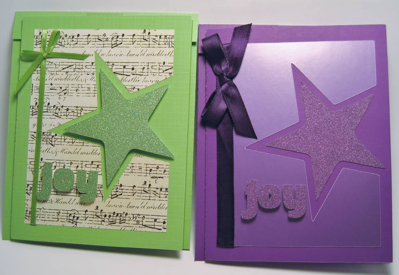
Xmas Card
It's funny how just changing a couple things make a card pop. I started with the purple and thought it was OK, but when I started the green, I changed the background paper and used pop-dots on the star and letters. I like it much better!


-
Photo Details
-
See all User Photos0
Additional Categories: Bev's Projects Date: 9/29/13
-
-
-

-
Comments
-
kerstin
amazing!
#1 10/26/13 3:46am

melin
MelinOh I like them both! The green one really stands out, but the purple one has a really understated and classy look to it. They both rock! Great way to show how the same file can look so different with a few small changes!
Melin Visit My Blog: http://www.MyPaperCrafting.com#2 11/5/13 10:27am
-