I have seen more fonts than I want to admit to. I’ll blame my first career as a graphic designer for that. Over that career, I’ve had a number of problems with free fonts. Since most people don’t want to pay for fonts—and neither do I!—I’ve used a lot of free fonts. The vast majority of the time, you’re not going to have a problem with a free font as a scrapbooker. It’s graphic designers that have trouble with free fonts because they usually don’t have any specialty characters—such as letters with accent marks on them (like ñ and é) that are needed when typesetting books and newspapers. You probably won’t encounter this issue with free fonts when you’re making a page, which is great!
But just because you don’t need special chartacters and glyphs, doesn’t mean you won’t have a problem with free fonts! Ever download a font for your Inspiration and discover it doesn’t cut straight? That it takes forever to cut? That there are jagged points instead of perfect corners, or it seems kind of ‘blobby’ or wavy, when it should be clean and straight? It could be that your free font was designed by an inexperienced designer and they made some mistakes… or it could be a knock-off font!
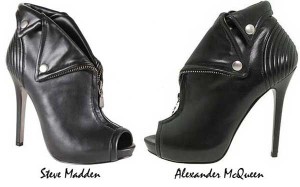
 Just like designer handbags and shoes have knock-offs, professional fonts, the kind you would pay for, are often ripped off by people seeking a cheap (or free) way to use the font. I won’t go in to the steps of how they do it, but I will show you how to recognize one, and how to decide what you want to do about it.
I was looking for some fonts to go with some Deco Frames I just made, and I found this font on my favorite free font website, www.DaFont.com.
 Looks nice, right? Too bad, because I know it’s a knock-off! Look closely! See the diagonal cross-bar on the N? It’s kind of wavy, like it’s not a real straight line. And the bottom of the D and the cross-bar on the G aren’t flat. All the serifs (the ‘feet’ on the ends of some letters) are more blobs than sharp points. And the ‘hand-tooling’ (the squiggly cut-out bits) are un-even in places, and not the same size from letter to letter. These are the signs of a knock-off font.

That this font isn’t perfectly straight and clean might not bother you. It lends a kind of hand-done look to it, which might be great for your layout. The law as I know it, says that you can use this ‘fake’ font if you want. You didn’t make it yourself, you didn’t copy someone else’s font, you didn’t distribute it. It is the person who made the fake who is liable against the law for taking someone else’s copyright for their own purpose. I’m not a lawyer, but it sure seems like you can use this font if you want.
But what if you don’t want to cut a ‘blobby’ font? What if you want nice straight lines and sharp serifs? How do we find the real font? Usually this is pretty easy, with a service called What the Font from MyFonts.com.
To use What the Font, you need to upload a picture sample of the font. The bigger the image, the better. Black and white is best. I did it with the screenshot I took off DaFont (above, the one without the red lines). What the Font will ‘look’ at the image and try to identify the characters. If it got any wrong, it will let you correct them. Then it will give you the name of the font!

Our real font is Melina Fancy BT. The ‘BT’ stands for Bitstream, which a professional company that makes fonts, otherwise known as a ‘font foundry.’ And what a difference between the two! Look at how all the lines are flat, the serifs are more clearly defined, and the hand-tooling is neat, straight lines. Even the dot in the center of the period is perfect. These are the hallmarks of a professional foundry and a real typeface.
Now, I know what you’re thinking, “Amanda_H, why would I pay $29 for this font when I can download the knock-off for free?” Or, maybe you’re thinking, “Oh no, I’ve downloaded a bunch of stolen fonts!” Relax! You can use the free font if you want to, just know it’s a knock-off and keep your eyes out for weird things in your cutting, like jagged corners and slow cutting times. If you’ve downloaded a bunch of free fonts that cut well, you can keep them if you want. You don’t need to replace your entire font library just because it’s not made by a professional type foundry. If your fonts cut well, I say keep them.
If you have a font that is bumpy, wobbly, jagged, or just doesn’t cut right, it could be a free font designed by an inexperienced designer, or it could be a knock-off. If you discover your font is a knock-off and if you like the original, professional font, thank the type foundry by buying it! Graphic designers and type artists the world over will love you for it.


Thanks for the valuable info. I use the dafont site all the time and I’ve seen exactly what you mean. Now I know what to look for!
I just fix the fonts using the tools in the software.
Me too! I just fix the fonts in my inspiration software for my own use. I don’t sell them or pass them off as my own.
Was the “Craft Room Members, check them out here” supposed to be a link to the deco frames?
Hey September, sorry about that missing link! The Deco frames are actually not up yet but look for them to be released in the library soon!